Get Indexology® Blog updates via email.

In This List

The Smartest Beta

It’s a New Day

Bull Run for the S&P BSE SENSEX Series in 2017

Asian Fixed Income: 2017 Pan Asia Report Card

Large Caps and Growth Outperformed By Most Since 1999

The Smartest Beta

Contributor Image
Tim Edwards

Managing Director, Index Investment Strategy

S&P Dow Jones Indices

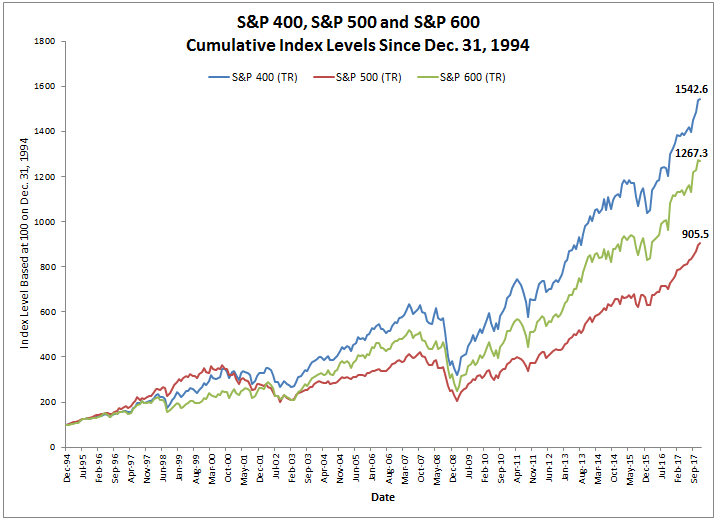
In the last year, plain old beta performed remarkably well in comparison to the so-called “smart” alternatives tracking large-cap U.S. equities.  Of the 17 different strategies reported in our year-end factor dashboard, less than a third outperformed the S&P 500’s total return of 21.83% over the last 12 months.

When they are criticized as the basis of investment strategies (or at any rate when alternatives are promoted) cap-weighted equity benchmarks tend to be ascribed with certain “flaws” – in particular: an undue concentration in the largest stocks or sectors; a disregard for valuations; and a propensity to overweight recent outperformers.  Ironically, it was the supposed flaws of capitalization-weighted benchmarks that drove their relatively strong performance last year.

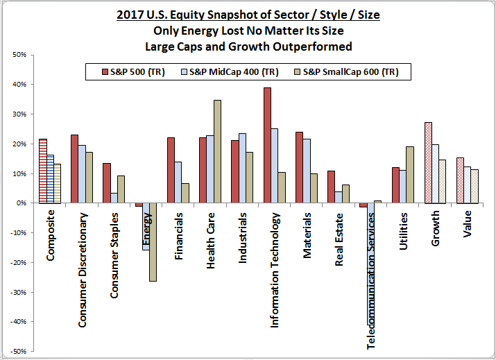
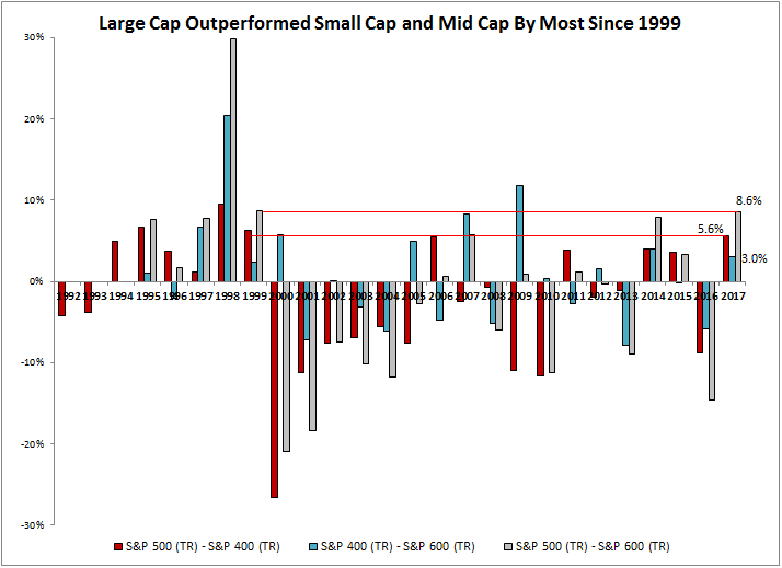
In 2017, size mattered.  The smallest quintile of S&P 500 constituents (based on prior year-end market capitalizations) averaged a total return of only 8.4%, while the largest stocks gained 22.3%.  In between, returns increased monotonically with size quintile.

Moreover, the U.S. market’s largest sector (Information Technology) had a banner year, soaring by 39% over the year and driving strong correlations between an index’s allocation to the sector, and its total return over the year. 

These size and sector perspectives are useful because nearly all smart beta strategies will – unless explicitly controlled for – underweight the largest stocks or sectors.   (Strategies based on momentum, growth or quality can provide occasional exceptions.)

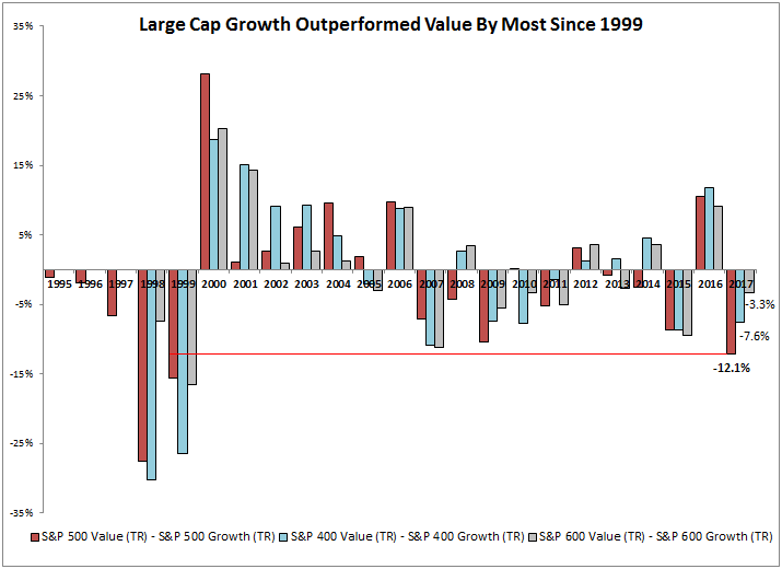
As we’ve argued previously, the performance of an equal weight index is a useful tool to gauge whether capitalization weighting alone helped or hindered returns.  Last year, the S&P 500 Equal Weight underperformed its parent by around 3% – a material hurdle for smart beta to overcome through stock selection and additional weighting tweaks.  Those that did outperform largely did so through exposures to the factors said to weaken market benchmarks – owning larger stocks, or underweighting value, or simply following the trend.

The posts on this blog are opinions, not advice. Please read our Disclaimers.

It’s a New Day

Contributor Image
Jamie Farmer

Former Chief Commercial Officer

S&P Dow Jones Indices

Yesterday, the first markets day of the New Year, the Dow Jones Industrial Average® continued its advance, finishing up 104.79 points for a 0.42% gain. How does that stack up against the post-holiday return to trading in prior years? Meh…it was nothing special.

Not to look a gift horse in the mouth, mind you. A gain is a gain is a gain. But it’s far from the best first day ever. In fact, it only ranks as 51st of 121 observations since the DJIA’s inception. The best—Jan. 4, 1988—came as world banks reported buying dollars to curb the U.S. currency’s decline.

But wait. How does the first day presage annual performance? Is it at all predictive of the year, does it set the tone for the next 12 months? Well, when the Dow rises on Day 1, the whole year experiences a positive return 68% of the time. Sounds good, right? Not really. Similarly, when the Dow falls on Day 1, the whole year is up 65% of the time.

Fact is, the DJIA has a positive annual return 66% of the time. Period. In other words, the DJIA closes the year with a gain two-thirds of the time, regardless of what happens on Day 1. So, no. No predictive power whatsoever. But, of course, you already knew that. There is simply too much time, too many things that influence stocks over the course of a year. The first day no more sets the tone than does Bangladeshi butter production.

Turns out this post is a tale, told by this idiot, full of sound and fury and signifying nothing. Go back to your business.

The posts on this blog are opinions, not advice. Please read our Disclaimers.

Bull Run for the S&P BSE SENSEX Series in 2017

Contributor Image
Ved Malla

Associate Director, Client Coverage

S&P Dow Jones Indices

The S&P BSE SENSEX Series comprises three indices, namely the S&P BSE SENSEX, the S&P BSE SENSEX 50, and the S&P BSE SENSEX Next 50. The S&P BSE SENSEX is the oldest and the most-tracked index in India and comprises 30 large, well-established, and financially sound companies within the S&P BSE 100. The S&P BSE SENSEX 50 is designed to measure 50 of the largest and most liquid companies within the S&P BSE 100. The S&P BSE SENSEX Next 50 is designed to measure 50 of the largest and most liquid companies within the S&P BSE 100 that are not members of the S&P BSE SENSEX 50.

Let us now compare the returns of the S&P BSE SENSEX, the S&P BSE SENSEX 50, and the S&P BSE SENSEX Next 50 for this calendar year, as of Dec. 31, 2017.

Exhibit 1: Index Absolute Returns
INDEX INDEX VALUE ON DEC. 31, 2016 INDEX VALUE ON DEC. 31, 2017 ABSOLUTE RETURN (%)
S&P BSE SENSEX (TR) 37,472 48,550 29.56
S&P BSE SENSEX 50 (TR) 9,805 12,939 31.96
S&P BSE SENSEX Next 50 (TR) 31,246 44,027 40.90

Source: S&P Dow Jones Indices LLC. Data from Dec. 31, 2016, to Dec. 31, 2017. Past performance is no guarantee of future results. Table is provided for illustrative purposes and reflects hypothetical historical performance. The S&P BSE SENSEX Next 50 was launched on Feb. 27, 2017.

In Exhibit 1, we see that in the 12-month period ending Dec. 31, 2017, the absolute returns of the S&P BSE SENSEX, S&P BSE SENSEX 50, and S&P BSE SENSEX Next 50 were 29.56%, 31.96%, and 40.90%, respectively.

Exhibit 2: Index Total Returns

Source: S&P Dow Jones Indices LLC. Data from Dec. 31, 2016, to Dec. 31, 2017. Past performance is no guarantee of future results. Chart is provided for illustrative purposes and reflects hypothetical historical performance. The S&P BSE SENSEX Next 50 was launched on Feb. 27, 2017.

In Exhibit 2, we see the total return index level chart for the S&P BSE SENSEX, the S&P BSE SENSEX 50, and the S&P BSE SENSEX Next 50. The S&P BSE SENSEX Next 50 consistently outperformed the S&P BSE SENSEX and S&P BSE SENSEX 50 during the 12-month period ending Dec. 31, 2017.

Exhibit 3: Sector Breakdown of the S&P BSE SENSEX, S&P BSE SENSEX 50, and S&P BSE SENSEX Next 50 

Source: S&P Dow Jones Indices LLC. Data as on Dec. 31, 2017. Chart is provided for illustrative purposes.

From Exhibit 3, we can see that as of Dec. 31, 2017, the financial sector had the highest weight in the S&P BSE SENSEX Series, while the real estate sector had the lowest weight.

For the year ending Dec. 31, 2017, we can state that the S&P BSE SENSEX Series has shown promising returns. The S&P BSE SENSEX added over 14 lakh crores of market cap during this period. We can conclude by saying that 2017 has been a great year for the S&P BSE SENSEX Series, as the indices have given outstanding returns.

The posts on this blog are opinions, not advice. Please read our Disclaimers.

Asian Fixed Income: 2017 Pan Asia Report Card

Contributor Image
Michele Leung

Former Director, Fixed Income Indices

S&P Dow Jones Indices

The S&P Pan Asia Bond Index, which seeks to track local currency bonds in 10 countries and is calculated in USD, reversed its loss in 2016 and delivered a total return of 7.86% in 2017. Meanwhile, its yield-to-maturity widened 123 bps to 4.64% YTD. The S&P Pan Asia Corporate Bond Index outperformed the S&P Pan Asia Government Bond Index and gained 8.30% over the same period. The size of Asia’s local currency bond markets, as measured by the S&P Pan Asia Bond Index, continued to expand and grew 17% to reach USD 12.1 trillion in 2017.

The 10 country-level bond indices calculated in local currencies ended the year with mixed returns. The three outperforming countries within the S&P Pan Asia Bond Index were Indonesia, Malaysia, and India. The S&P Indonesia Bond Index jumped 15.25% in 2017, while its yield-to-maturity tightened 16 bps to 6.35%, making Indonesia the best-performing country in Pan Asia for the year. The S&P Malaysia Bond Index rose 5.19% YTD, while its yield-to-maturity tightened 2 bps to 3.88%. The S&P BSE India Bond Index gained 4.21% YTD, and its yield-to-maturity widened 24 bps to 7.47%.

The S&P China Bond Index lost 0.29% in 2017; it was the only country within Pan Asian bond markets that posted a negative return. Meanwhile, its yield-to-maturity widened 19 bps to 4.77%. The performance of the S&P South Korea Bond Index also lagged other countries, but it was still up 0.53% YTD (see Exhibit 1).

Looking at the yield-to-maturity in Exhibit 2, India had the highest yield, at 7.47%, followed by Indonesia with 6.35%, and China with 4.77%. On the other hand, the lowest-yielding country was Taiwan with 0.89%, followed by Hong Kong, which was slightly higher at 1.10%.

Exhibit 1: Total Return of the S&P Pan Asia Bond Index Family in 2017

Exhibit 2: Yield-to-Maturity of the S&P Pan Asia Bond Index Family in 2017

The posts on this blog are opinions, not advice. Please read our Disclaimers.

Large Caps and Growth Outperformed By Most Since 1999

Contributor Image
Jodie Gunzberg

Former Managing Director, Head of U.S. Equities

S&P Dow Jones Indices

In December, the S&P 500 (TR) gained 1.1%, posting its 14th consecutive monthly gain, the longest monthly streak on record (data since Sep. 1989.) Also, the S&P MidCap 400 (TR) gained 0.2%, while the S&P SmallCap 600 (TR) lost 0.5%, bringing the 2017 performance to a respective 21.8%, 16.2% and 13.2% for the S&P 500 (TR), S&P MidCap 400 (TR) and S&P SmallCap 600 (TR).

Source: S&P Dow Jones Indices.

Though in December, the energy sector gained most in mid-caps (+6.9%) and small-caps (+5.5%,) while telecom gained most in large caps (+5.8,) nothing notable in sector performance on the positive side happened in December.  However, the utility sector had a particularly bad month.  The S&P 600 Utilities (Sector) (TR) had its 13th worst month on record, losing 5.8%, its worst since Sep. 2014, while the S&P 500 Utilities (Sector) (TR) lost 6.1%, posting its worst month since Feb. 2015, and the S&P 400 Utilities (Sector) (TR) lost 5.2%, posting its worst month since Jun. 2015.  

Source: S&P Dow Jones Indices.

Despite the gains in Dec. from energy and telecom, it wasn’t enough to get their sectors positive for the year, but all other sectors (9 of 11 in total) were positive across market cap sizes in 2017.  During the bull market since 2009, at least 9 of the sectors have been positive across market caps in every year except in 2011 and 2015, which is a much higher positive move in lockstep than the 50% rate before 2009 (back to 1990.)  Note energy was the only sector negative in 2017 across all market caps, which is not surprising in a positive year for the S&P GSCI Energy (+12.3%).  

Source: S&P Dow Jones Indices.

Also, in the above charts, although in December value outperformed growth no matter the size, growth outperformed value for the year.  Historically, value outperforms growth in about half of the months since Feb. 1994 with 52% of months where value beats growth in the S&P 500, 51% of months in the S&P 400 and 48% of months in the S&P 600.  The premiums and discounts are also very close with an average monthly value premium of 1.7%, 1.9% and 1.6%, and discount of
-1.7%, -2.0% and -1.7%, respectively for the S&P 500, S&P 400 and S&P 600.  The value premium and discount is also strikingly close when measured on an annual basis with average annual value premiums of 7.3%, 8.0% and 6.8%, and discounts of -8.0% -11.4% -6.7%, respectively for the S&P 500, S&P 400 and S&P 600.  However, year by year, the style matters and in 2017 growth outperformed value by the 3rd most in a year and the most since 1999.

Source: S&P Dow Jones Indices.

While style mattered, and choosing growth over value would have paid off, choosing large-cap would have helped too, with 7 of the 11 S&P 500 sectors outperforming their mid-cap and small-cap counterparts.   The size premiums on average per month are also very close (like style) with large beating mid in 49% of months, mid beating small in 54% of months and large beating small in 50% of months.  On average in a month, when large beat mid, it was by 1.4% with a loss of 1.8% when mid beat large.  Also when mid beat small it was by 1.4% and the loss was 1.5% on average in a month when small beat mid.  When large beat small, it was by 2.2% and when small beat large it was by 2.4% on average in a month.  So, there is an argument for the small size premium but on average in a month, it is small.  By year, it makes more of a difference with an average annual premium of 5.0% (large-mid,) 5.4% (mid-small) and 7.0% (large-small,) with respective discounts of -7.4%, -4.5% and -10.2%.  In 2017, large-caps outperformed both mid-caps and small-caps by the most since 1999.

Source: S&P Dow Jones Indices.

Based on history, it seems the large caps never held onto outperformance this big, so perhaps it will be a better year for the mid and smaller cap equities ahead.  If it is time for small caps, and even more so value with quality, the S&P SmallCap 600 should be the small-cap benchmark of choice… and here’s why.


The posts on this blog are opinions, not advice. Please read our Disclaimers.