Get Indexology® Blog updates via email.

In This List

Tools for Managing Home Price Risk Are Emerging

Considerations for a Global Approach to Property Investing

The Yield-Grab Faucet Remains Open, as Long as Rates Are Range Bound

A Tale of Two Energy Cities – Dallas and Denver

Sluggish GDP Growth

Tools for Managing Home Price Risk Are Emerging

Contributor Image
Reid Steadman

Former Managing Director, Global Head of ESG & Innovation

S&P Dow Jones Indices

S&P Dow Jones Indices offers information for hundreds of indices on our website, but two in particular drive a large portion of our traffic: the S&P 500 and the S&P/Case-Shiller Home Price Indices.

It’s easy to understand why people would be searching for the S&P 500. By using this popular index and the financial products tied to it, you can measure your portfolio’s relative performance, invest in the equity market, hedge against risk, and even lever up your exposure.

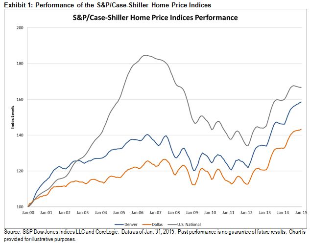
And what can you do with the S&P/Case-Shiller Home Price Indices? Well, up to now, exactly this: see how much aggregate home prices have gone up or down.

You may wonder why the S&P 500 is presently so much more useful than the S&P/Case-Shiller Home Price Indices. This is due to the fact that investment companies can buy, hold, and sell the shares that make up the S&P 500. This allows investable products to exist.

But what can be done with an index made up of single, residential homes that are privately held and rarely bought and sold? So far, the answer has been “not much,” but this is changing.

Some clever product designers are exploring how the S&P/Case-Shiller Home Prices Indices can be used to shift home price risk from one party who wants less of it to another party that wants more. This article highlights one such solution, which allows homeowners to monetize today the future appreciation of their homes. Other interesting concepts will likely follow.

These products work by carefully matching investors willing to assume opposing sides of a trade. The first task is for these parties to agree on a price, which, in the case featured in the article, is to be determined by the S&P/Case-Shiller Home Price Indices at a point in the future. The people using the product must also agree to a holding period for the transaction.

It’s important that better tools emerge to help homeowners manage risk. A lot is at stake. Homes represent approximately half of the net worth of US households. Currently, this wealth is difficult to unlock without selling your home, and no one wants to go through that costly transaction unless they really have to.

The posts on this blog are opinions, not advice. Please read our Disclaimers.

Considerations for a Global Approach to Property Investing

Contributor Image
Michael Orzano

Head of Global Exchanges Product Management

S&P Dow Jones Indices

While U.S. REITs have garnered a lot of attention in recent years and become quite a popular investment category, comparatively little attention has been paid to real estate securities based outside of the U.S., despite significant development in international markets.  In February 1995, just three markets—Australia, the Netherlands, and the U.S.—were represented in the S&P Global REIT Index.  By 2005, this had increased to 10 markets, and today, 23 markets are represented in the index, including several emerging market countries.  As depicted in Exhibit 1, U.S. REITs have decreased from representing about 73% of the global REIT market in 1995 to representing 63% in 2015.  This has occurred despite significant outperformance of U.S. REITs over the past several years (which has, of course, supported higher U.S. weightings).

Capture

The Importance of Including REOCs in Global Property Indices

In the U.S., virtually all public companies with businesses focused on real estate investment are structured as REITs.  However, many countries around the world either do not have legislation authorizing REITs, or the REIT structure has not become as ubiquitous, which leaves many property companies outside of the scope of indices that only include REITs.  As a result, more inclusive property indices, such as the S&P Global Property, are widely utilized in global markets because they include REOCs and other diversified real estate companies.  These indices screen individual companies to ensure that the majority of their business activities involve the ownership and operation of real estate assets.

Capture

As Exhibit 2 illustrates, the inclusion of REOCs in the S&P Global Property leads to a significant decrease in concentration to the U.S. market (from 63% to 44%) and a substantial increase in exposure to international markets.  Particularly noteworthy is the increase in weight to emerging markets (from 3% to 10%), where few countries have REIT-like structures in place.

Conclusions

With the U.S. representing less than half of the available universe of globally listed property stocks, focusing on U.S. REITs alone can be viewed as a restrictive and undiversified approach to asset allocation.  Taking a global approach to property investing may reduce risk through increased diversification, while providing similar investment characteristics to U.S. REITs, such as high current income generation and the potential for long-term capital appreciation.  The choice of a global property benchmark is also key, as the use of a REIT-only index can be highly limiting from a geographical diversification standpoint.

To learn more about the evolution of global real estate securities, their investment characteristics, and their historical impact on portfolio risk/return characteristics, please see our paper, Considerations for a Global Appraoch to Property Investing.

The posts on this blog are opinions, not advice. Please read our Disclaimers.

The Yield-Grab Faucet Remains Open, as Long as Rates Are Range Bound

Contributor Image
Kevin Horan

Former Director, Fixed Income Indices

S&P Dow Jones Indices

Crude oil has been able to recover from its recent free fall and has stabilized at USD 57 over the week.  The stability in oil, with the expectation of prices going higher, has investors changing their view from deflation to an increasing inflationary expectation.  The performance of the S&P U.S. TIPS Index does not reflect the current inflation conversation.  Part of the reason for this is the additional supply of USD 18 billion in five-year TIPS that were auctioned on April 23, 2015.  In preparation for the auction, traders sold positions, driving the index down over the course of April 20-22, 2015.  The auction was considered a success, with heavy demand, setting a coupon that is the lowest coupon rate since 2013.  Following the auction, the index rose 0.69%, but this was not enough to offset the -1% of pre-auction selling.  The index has returned 1.24% MTD and 2.51% YTD, as of April 24, 2015.

As rates have remained relatively range bound since the middle of March 2015, the performance difference between investment-grade and high-yield bonds has investors interested on both sides of the fence.  The view on a Fed rate increase has drifted from a September time frame, and some market participants are now mentioning December.  The hunt for yield is still on, as long as rates remain relatively stable or range bound.

  • The MTD performance of the S&P U.S. High Yield Corporate Bond Index (1.71%) is outperforming the more credit-worthy S&P U.S. Investment Grade Corporate Bond Index (0.34%), as of April 24, 2015.  As of the same day, the YTD performance story is the same, as investment-grade bonds have returned 2.47%, while high-yield bonds have return 4.40%.
  • The S&P Crossover Rated Corporate Bond Index captures a range of both investment-grade and high-yield bonds, as its constituents range between ratings of BBB+ down to BB-.  The index has returned 0.71% MTD and 3.11% YTD (as of April 24, 2015).
  • The S&P/LSTA U.S. Leveraged Loan 100 Index, which holds secured bank loans from speculatively rated issuers, has returned 0.75% MTD, much like the crossover index, but its YTD performance lags behind, at 2.61% as of April 26, 2015.

Source: S&P Dow Jones Indices, data as of 4/24/2015, senior loan data as of 4/26/2015.

The posts on this blog are opinions, not advice. Please read our Disclaimers.

A Tale of Two Energy Cities – Dallas and Denver

Contributor Image
Marya Alsati

Former Product Manager, Commodities, Home Prices, and Real Assets

S&P Dow Jones Indices

This post examines the relationship between Dallas and Denver, utilizing the S&P/Case-Shiller Home Price Index for each city.  The pair was selected based on a correlation analysis that yielded a correlation coefficient of 0.84 between the two cities.  This analysis covered the 20 metropolitan indices in the S&P/Case-Shiller Home Price Index series, utilized log returns to account for the skewness in the home price data, and spanned a time period of 14 years.

Exhibit 1 depicts the levels of the home price indices for Dallas, Denver, and the entire U.S.  For both Dallas and Denver, a trough was felt in February 2009, and the indices are now up 27.7% and 31.8% since that time, respectively (as of Jan. 31, 2015).  Both Dallas and Denver have been recording new peaks since the first quarter of 2014.

Capture

Exhibit 2 summarizes the results for January 2015, showing the year-over-year percent changes.  It can be seen that Dallas and Denver are two of the best performers, up 8.1 and 8.4%, respectively.

Capture

To attempt to identify drivers that could explain the correlation, we evaluated various housing factors, such as foreclosure rates, housing permits, population change and employment by industry.

In terms of population change, Dallas and Denver grew at varying rates.1  Dallas lost 30% and Denver lost 29.1% in permit issuance for single-family homes between 2004 and 2013,2 and Denver had a slightly worse foreclosure rate (1.4%) than Dallas(0.4%).3  For employment by industry,4 “Trade, Transportation, and Utilities” was the highest employment industry for Dallas and Denver by a large margin.  It should be noted that this industry also had a large allocation from other, uncorrelated metro areas.

Capture

These findings led us to explore more theoretical analysis.  The energy industry is considered the cornerstone of Dallas and the North Texas economy.  Denver, long hailed the Houston of the Rockies, is the largest city in a 600-mile radius of energy companies that are investing in the oil and gas fields of Colorado, Wyoming, Montana, and North and South Dakota.5  Metro Denver and the Northern Colorado region ranked fourth for fossil fuel energy employment, and fifth among the nation’s 50 largest metros for cleantech employment concentration in 2014.6

The energy industry fuels jobs and activity across a range of fields, affecting population, income, and therefore, the housing market.  The industry is thus a strong candidate as a reason for what is driving Dallas and Denver’s intertwining performance.  It will be interesting to see what the impact of the plunging price of oil on the two cities will be, and if one (or both) will be affected, especially in comparison to the other metropolitan areas.

On a lighter note, and if you are still not convinced that there is a correlation between the two cities, here is a tidbit of information.  In 1981, ABC launched a Denver-based, oil tycoon soap opera to compete with the CBS primetime oil company-owning family series Dallas.

————————————————————————————————————————
1. Census.gov, Large Metropolitan Statistical Areas—Population: 1990 to 2010
2. Census.gov, New Privately Owned Housing Units Authorized Unadjusted Units by Metropolitan Area
3. Foreclosure.com
4. Bureau of Labor Statistics
5. Cathy Proctor, Denver Business Journal, “Denver posed for growth from energy sector – and millennials”.
6. http://www.metrodenver.org/industries/energy/

The posts on this blog are opinions, not advice. Please read our Disclaimers.

Sluggish GDP Growth

Contributor Image
David Blitzer

Former Managing Director and Chairman of the Index Committee

S&P Dow Jones Indices

First quarter U.S. GDP will be reported on Wednesday morning April 29th; the consensus is for only one percent real growth.  The last few years have been marked by poor GDP growth. The chart compares actual GDP to potential GDP and shows that six years after the Great Recession GDP remains well below its potential.   In the 22 quarters since when the recession ended in June 2009, GDP growth touched 5% only once; since 1980 GDP growth was 5% or higher in 16% of quarterly reports.  Growth is sluggish.


Among theories of why growth is slow, three stand out: too much debt, weak demand and slow labor force growth:

The amount of debt – government, household and corporate – in the economy surged before and during the financial crisis.  After the Great Recession, efforts to work down debt levels limited spending and investment and prevented a strong rebound.  Some analysts would describe the 2007-9 recession as a “balance sheet recession” meaning that high debt severely damaged balance sheets and companies and households were forced to devote any funds to debt service rather the spending.  Debt levels in the US economy have come way down. Households currently spend a record low percentage of income on debt service, corporate balance and earnings are much improved and the federal deficit is down to normal levels.  While there may be some remaining concerns about taking on debt – or extending credit – in the US, debt levels are not the only cause of sluggish growth.

In the depths of a recession, everyone hunkers down, stops spending and saves as much as possible, The paradox of saving – what makes sense for individuals, families or companies confronting hard times, can spell disaster for the economy.  The vanished spending makes the economy worse off.  With little or no spending or investing, a capitalist economy won’t grow.  In most recoveries, the pain of the recent recession is forgotten fairly quickly and growth resumes. This time the recession was far deeper and nastier and it is taking longer to put it behind us. Until a few months ago few believed that the unemployment rate would approach 6%; now it is 5.5%.  Lingering concerns from the Great Recession are still with us and may be deterring some spending and contributing to weak GDP growth.

Fewer people in the labor force and working means less production and slower GDP growth. The US labor force is growing less rapidly now than before the last recession. One factor is the aging of the baby boomers – people born between 1946 and 1964. The oldest among them are reaching retirement age.  A second factor is a drop in labor force participation – people of all ages seem less likely to hold jobs or look for work than was the case a decade or more ago.  While the aging of the population is easy to explain, the drop in labor force participation is a bit of a puzzle.  One possible factor is declining real wages – adjusted for inflation wages are flat to down and the returns to working, or working longer hours, may not be there for everyone.

The posts on this blog are opinions, not advice. Please read our Disclaimers.