Learning to read option risk graphs is important as it will help you visualize the possible outcomes of a strategy that you are contemplating, notes Russ Allen of Online Trading Academy.
I often use option payoff graphs to illustrate these articles. These are also known as risk graphs or position charts. All the terms mean the same thing—graphing the profit or loss of an option position versus the price of the underlying asset.
Learning to read these graphs is very important. Once you get the hang of it, you will be able to think of an option position in those terms, and literally “picture” the effect of any change.
Starting today, I’m going to go into some depth on how these graphs work, and how they can help you.
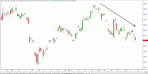
Below is a price chart for GLD, the gold exchange traded fund, as of October 10, 2013. GLD has been in a downtrend for a long time now. There were supply zones (resistance levels) above the October 2 price of $124.27 at roughly 128 and 130.

Figure 1 – GLD as of October 2, 2013
Click to Enlarge
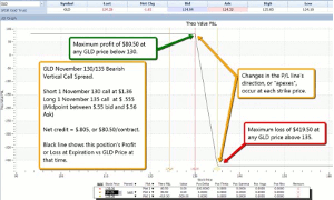
Purely for purposes of illustration, suppose we chose to make a bearish bet on gold by putting on a bear call spread. Using prices for our example that were at the midpoint between the bid and ask prices for the options, we could sell the November 130 call for $1.36; and simultaneously buy the November 135 calls at $.555. The net credit would be $.805 per share, or $80.50 for the contract.
Below is the payoff graph as of expiration for this trade.

Figure 2 – GLD Bear Call Spread, Profit or Loss at Expiration
Click to Enlarge
The black line on this graph shows the following:
- Maximum profit is $80.50, because that’s the highest level that the black line reaches (read the P/L off the left side of the chart, and the GLD price off the scale at the bottom of the chart).
- That $80.50 profit occurs when GLD is at $130 (the lower strike price), or at any price less than $130.
- If GLD is above $130, then the position’s profit will be less than the maximum.
- The black line is lower at successively higher prices of GLD (the line slopes downward), until it abruptly levels off at a GLD price of $135 (the higher strike price).
- At or above that $135 strike price, the maximum loss of $419.50 occurs.
This single Z-shaped line on the graph gives us quite a lot of information. At a quick glance, we can see that it is a bearish trade, because it has a downward-sloping section. We can also see that it has limited risk, because the line levels out at the bottom. Positions with unlimited risk have graphs that go off the chart at the bottom. Similarly, we can see that it is a limited-reward trade—it levels out at the top as well. At each strike price, the P/L line changes direction, creating an “apex.” These price levels are important—they define the points where the direction of things changes.
The height of the P/L line at each price tells us exactly what our profit or loss will be if GLD is at that price at expiration. We can see the $80.50 maximum profit, the $419.50 minimum loss, and all points between.
This is good info, but the charts can tell us much more.
Below is the same P/L chart, but with some additional lines.

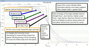
Figure 3 – GLD Bear Call Spread, Profit or Loss at Expiration, and at Three Additional Dates
Click to Enlarge
On this chart, note the three curved lines that have been added. The blue line shows the P/L at any GLD price, not at expiration, but as of October 2, when there were 36 days to go. The green line is where P/L will be at any price when there are 24 days to go; and the purple line at 12 days to go.
With these additional lines, we have more information about how different changes will affect our position.
NEXT PAGE: Getting a Visual Read
|pagebreak|Usually, only the blue curve and the black curve are plotted. These show us our P/L at different underlying prices as of the current time (blue line); and as of expiration day (black line). We would not normally see the green or purple lines. Instead, the blue “today” line would move take up a different position each day as time passed. When there were 24 days to go, the blue “today” line would be in the position that the green line is now, and so on. On expiration day, the “today” line and the black line are identical. Between now and then, each day the blue “today” curve moves a little closer to the black “at expiration” line, as if pulled by a bungee cord tied to the apex.
When drawn in this way, we can get a visual read in all the important Greeks. We’ll talk about delta today, and continue with the rest next time.
Delta – The slope of the P/L curve shows the delta. The slope is the “rise divided by the run.” If P/L risesby $1 when the underlying price runs up by $1, then the slope, and also the delta, would be 1.00/1.00 = 1. And if, as in this case between 130 and 135, P/L goes down by $1.00 when underlying price goes up by $1.00, then the delta is -1.00 /1.00 = -1. If P/L decreases by $.50 for a $1.00 move up in price, then the slope, and also the delta, are -.50/1 = -.5, and so on.
A line that is horizontal has zero slope. This would correspond to a situation where a change in underlying price has no effect on a position’s value. With vertical spreads like this one, zero slope occurs in two situations: The first is where GLD’s price is so low that both options are so far out of the money that they have no chance to get into the money. The value of both options will be zero, and so will their deltas. At expiration, that would be where GLD was anywhere below $130. In that case, it won’t matter just how much farther below $130 GLD is. As long as both of our options are worthless, our outcome is the same—we get to keep the $80.50 credit, and that is our profit.
The second case where our position delta would be zero is where GLD’s price is so high that both options are in the money, with no chance to be out of the money by expiration. On the expiration day itself, that would be any price above $135. In that case, with both calls in the money and no time to go, the $130 call would be worth exactly $5 per share more than the $135 call, so we would have to pay $500 to get out of the trade. Subtracting our initial credit of $80.50, our loss would be $419.50. This will be true no matter how much higher than $135 GLD is, if we are at expiration.
But look at the other three lines, which show our P/L at times before expiration. If we look at their angles at GLD prices of 130 and 135, they are not horizontal. They have considerable slope. And they are neither at our maximum profit or at our maximum loss. These lines do not go fully horizontal until price has moved much farther—either below $130 or above $135.
That means that if we were to close out this position at any time earlier than expiration day, our profit or loss would be much different than it will be at expiration. We can see just how much different by reading the difference between the P/L curve for that day, and the P/L curve at expiration.
That’s all we have space for today. Next time, we’ll discuss how the diagram also tells us a lot about the effects of price acceleration (gamma) and how volatility changes (vega) can be seen from the graph.
By Russ Allen, Instructor, Online Trading Academy


